Partnership — VCU Brandcenter
Building the brand with the Brandcenter
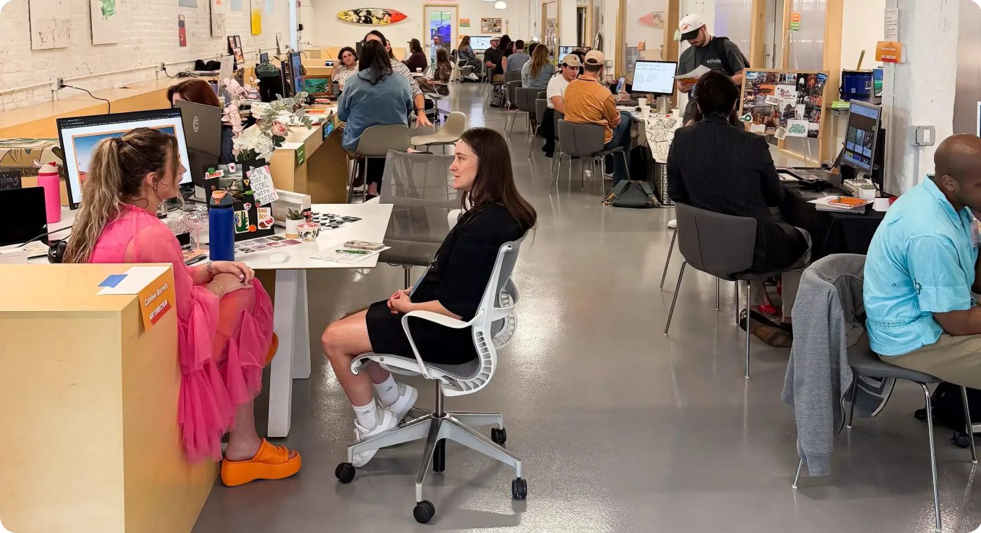
What the partnership covers
Brand identity
Reconciling the green logo system across site, app and branches
Website design
This site — officekitchen.xyz — designed with Brandcenter talent
Routes in
Sponsored assignment, capstone project, or paid freelance
Where things stand — honestly
Outreach opened November 2026: introductions to a Brandcenter executive and to an art-direction student (Class of 2027) via referral. Conversations, not agreements — nothing here is presented as a signed partnership until it is one.
The brand, in the Brandcenter
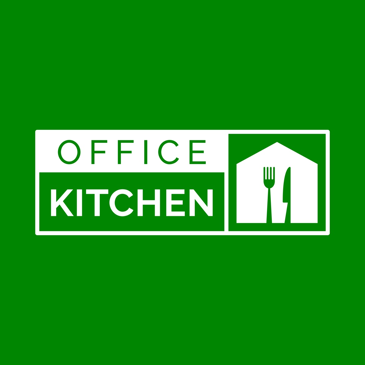
One logo, one green. The mark pairs a house outline with a fork and knife — the office table, set. OFFICE sits letterspaced in green; KITCHEN answers bold in white on green. Full guide on the Brand Guide page.
OK Green
#008601
Deep Green
#135825
Fresh Green
#2E9E4F
White
#FFFFFF
The logo — in detail
The mark, in detail
The Office Kitchen logo is the heart of the brand the Brandcenter partnership will design forward — so here is exactly what it is made of.
Primary lockup — the logo's green plus white, on a light field.
The house
An outline home/office drawn in a single white line on the green field — where work and food meet. The workplace, drawn as a home.
Fork & knife
The meal, set inside the house. The utensils sit at the centre of the mark the way food sits at the centre of the workday — the table is the point.
The wordmark
OFFICE, letterspaced in caps, above KITCHEN set bold. Two words, two weights: the office — and the kitchen it deserves.
One colour only
A single green plus white. Never recoloured, never on a gradient, never outlined. Every student concept for this brand starts from that discipline.
OK Green #008601
The logo's green — primary brand colour
Deep Green #135825
Hero panels, footers, big brand moments
Fresh Green #2E9E4F
Buttons and calls to action
Mint #E8F5E8
Soft panel tint behind content
Logo misuse
Six ways to never use it
The mark only works if it stays itself. These six treatments are never allowed — shown here so nobody has to guess.
Don't recolour it — one green, always
Don't stretch, squash or distort it
Don't rotate it or tilt it
Don't add shadows, outlines or effects
Don't sit it on a gradient
Don't place it on busy or clashing photos
See it at work: the badge lockup sits in the header of every screen in this prototype. The Spring 2027 brief for the partnership: extend this system — type, layout, motion, voice — without replacing the mark.